Zwoop Branding
01
Context

Zwoop
Smart prediction, smart staffing.
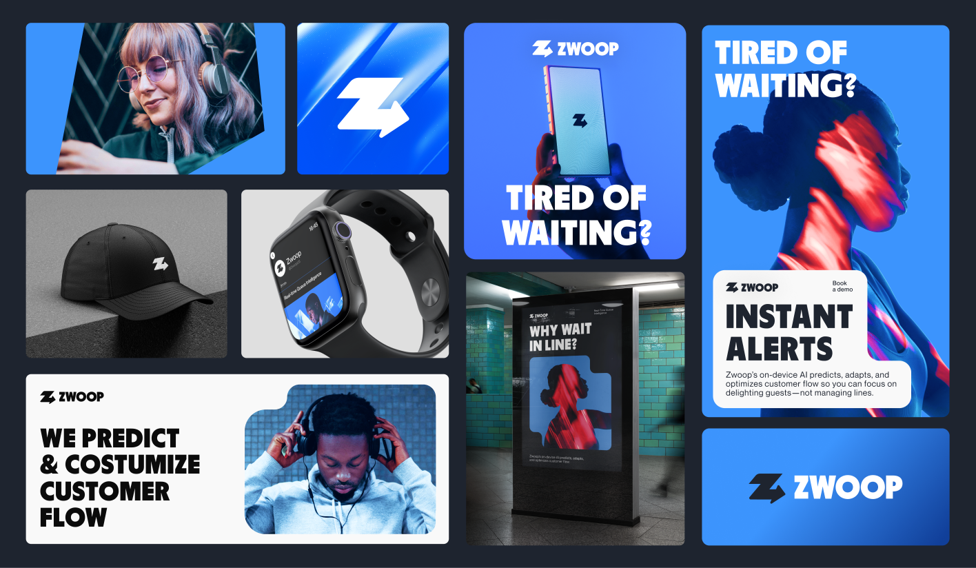
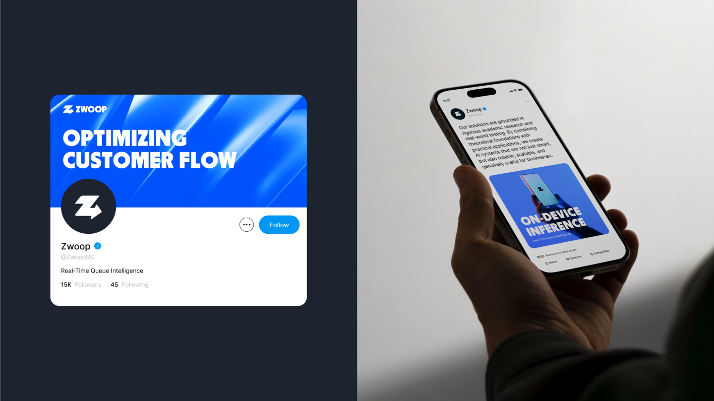
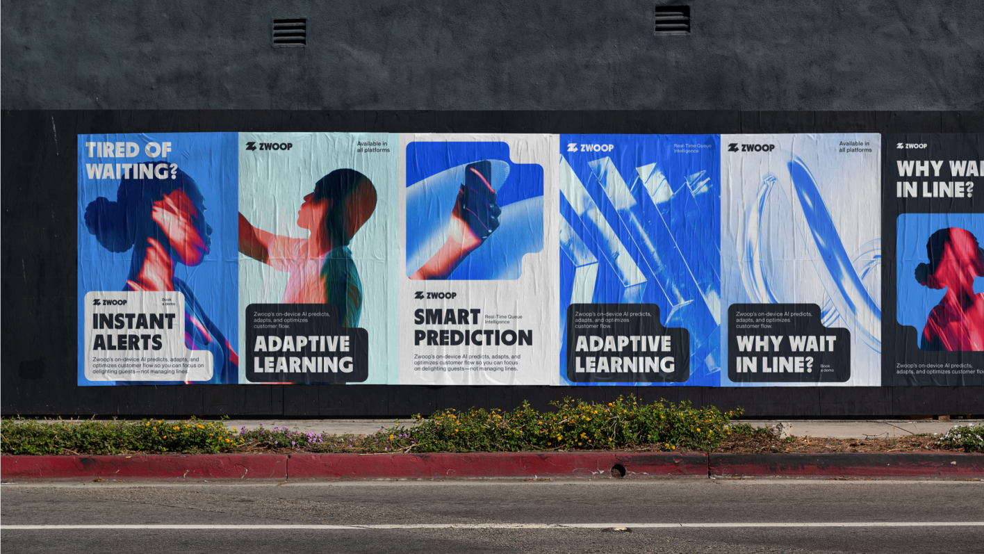
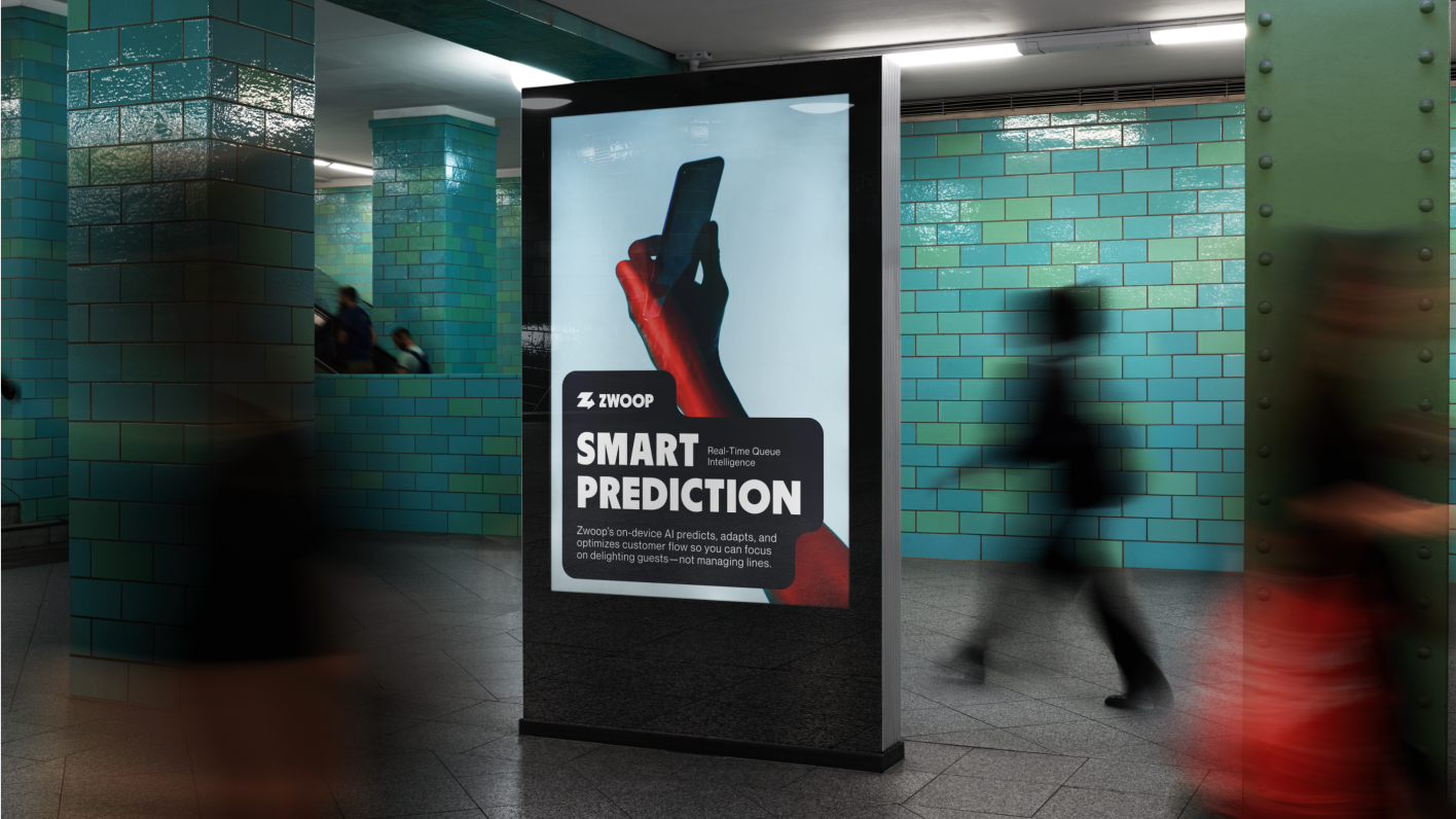
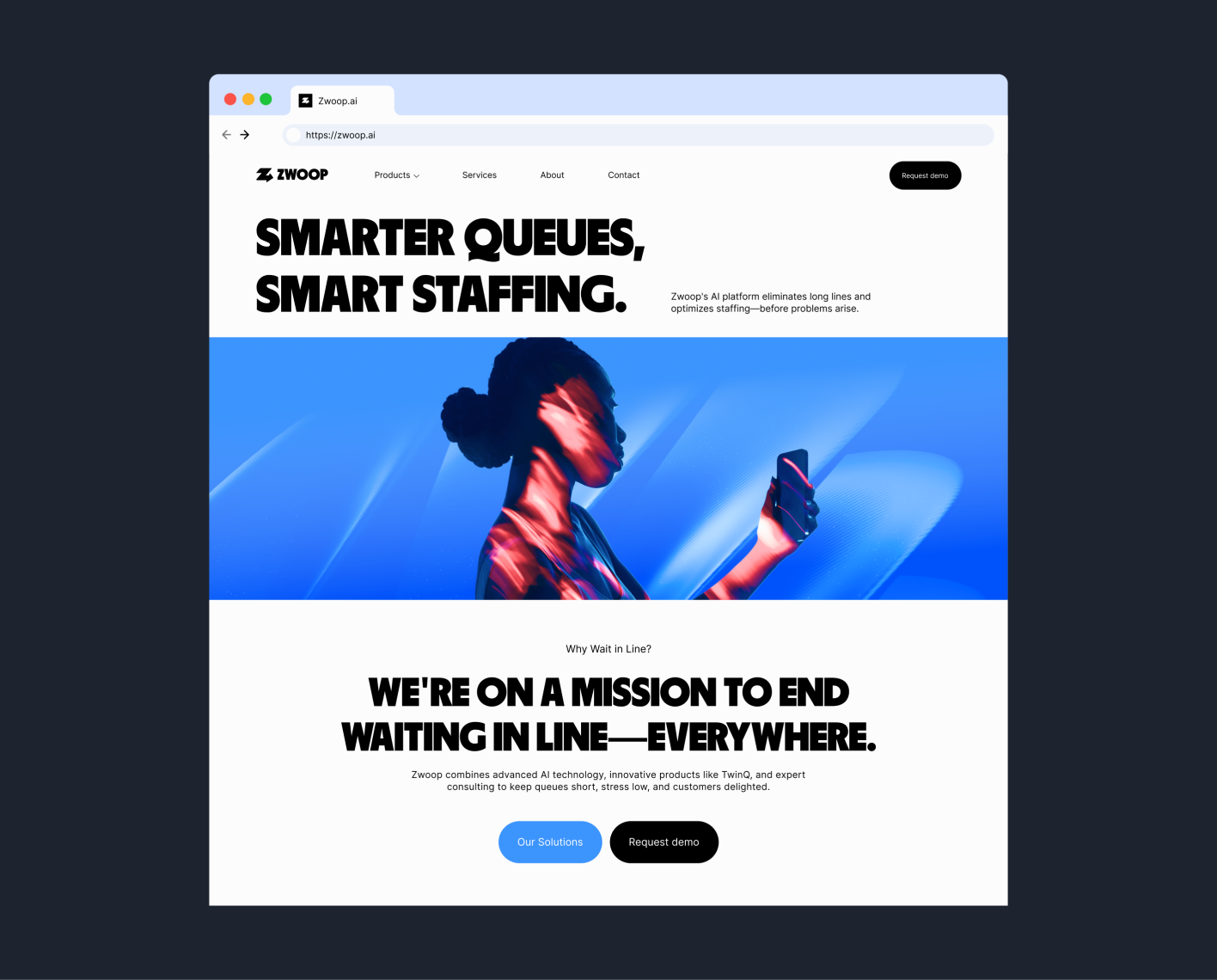
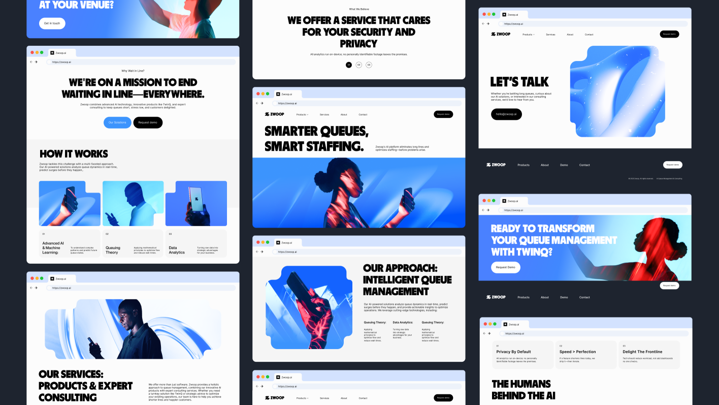
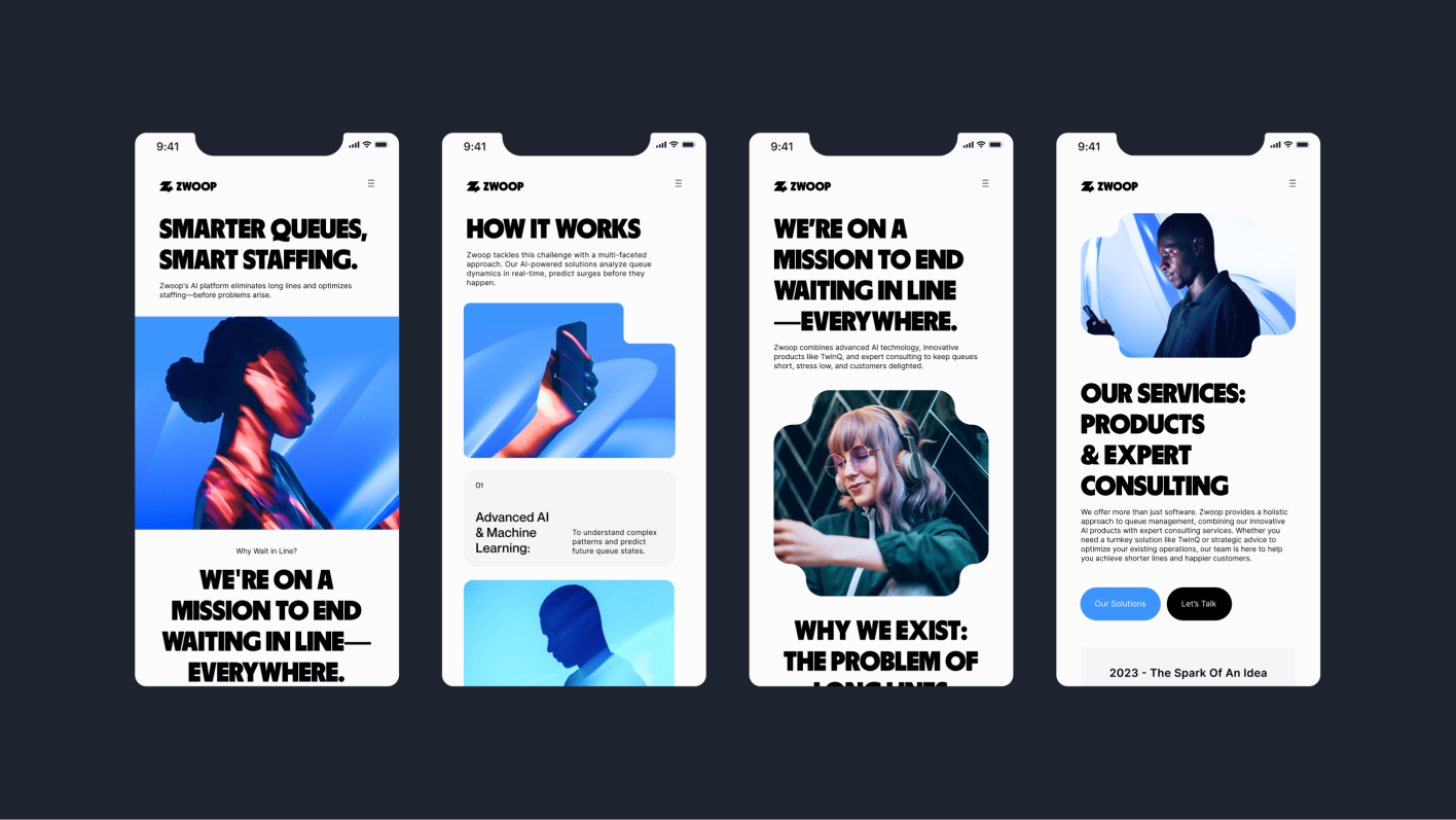
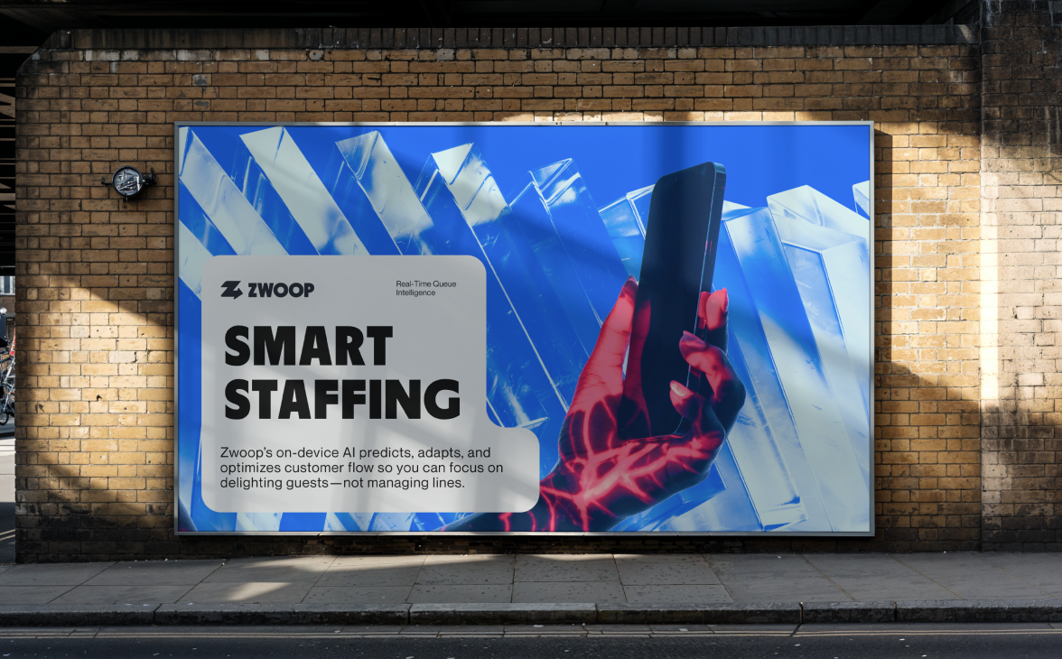
Zwoop Smart prediction, smart staffing. Zwoop is a new platform that eliminates long lines and optimizes staffing before problems arise. Their AI-powered solutions analyze queue dynamics in real-time, predict surges before they happen, and provide actionable insights to optimize operations. By combining advanced AI technology, innovative products like TwinQ, and expert consulting, Zwoop can keep queues short, stress low, and customers delighted.
02
Concept
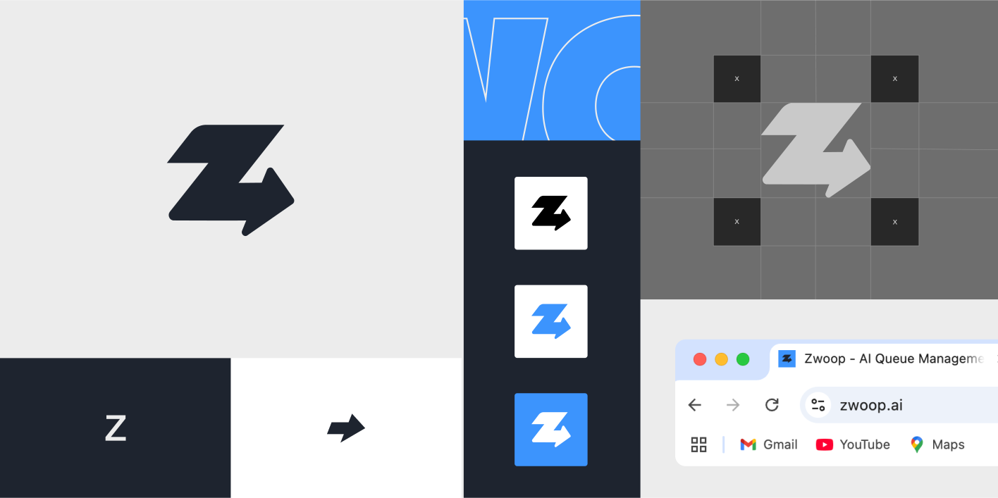
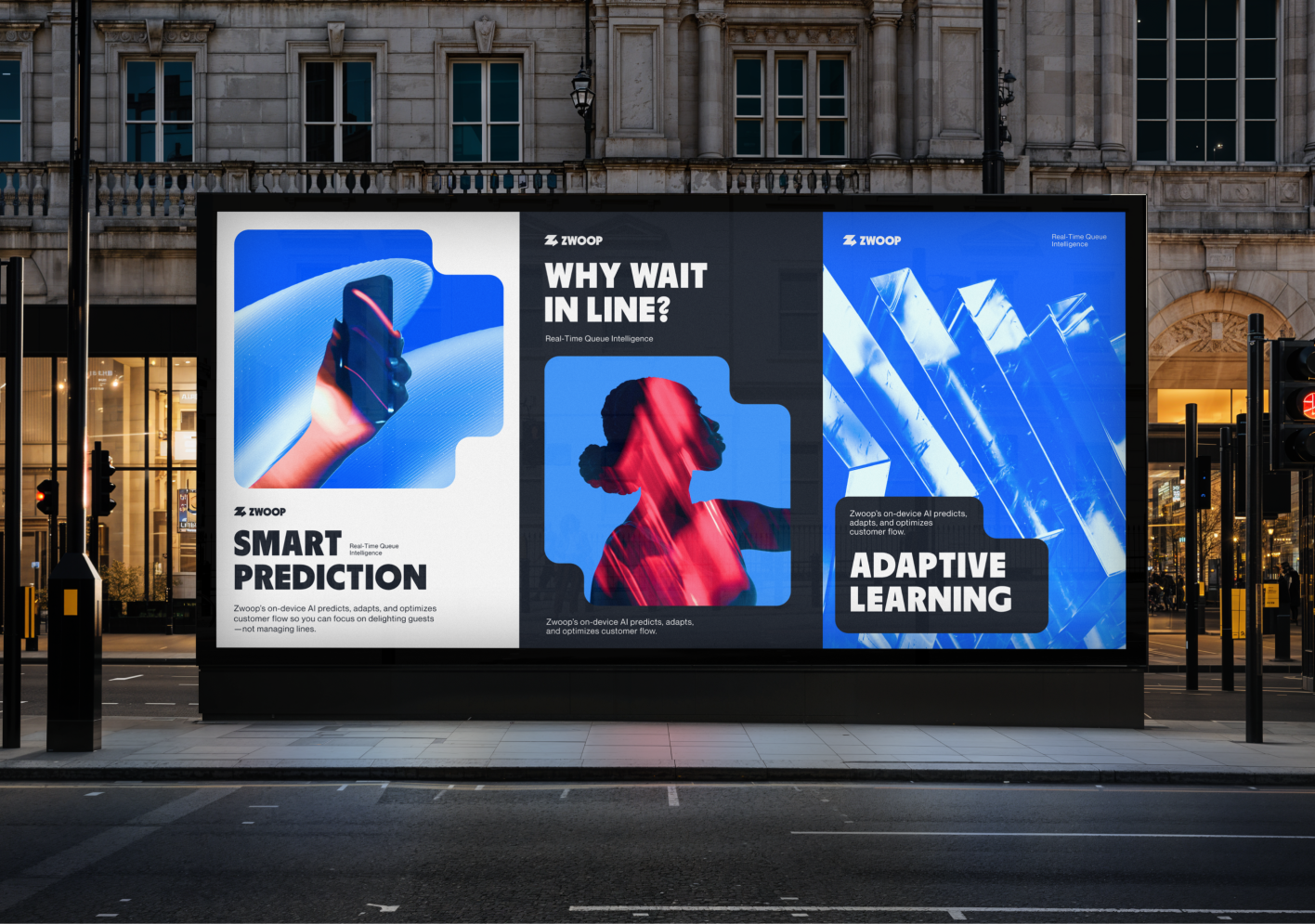
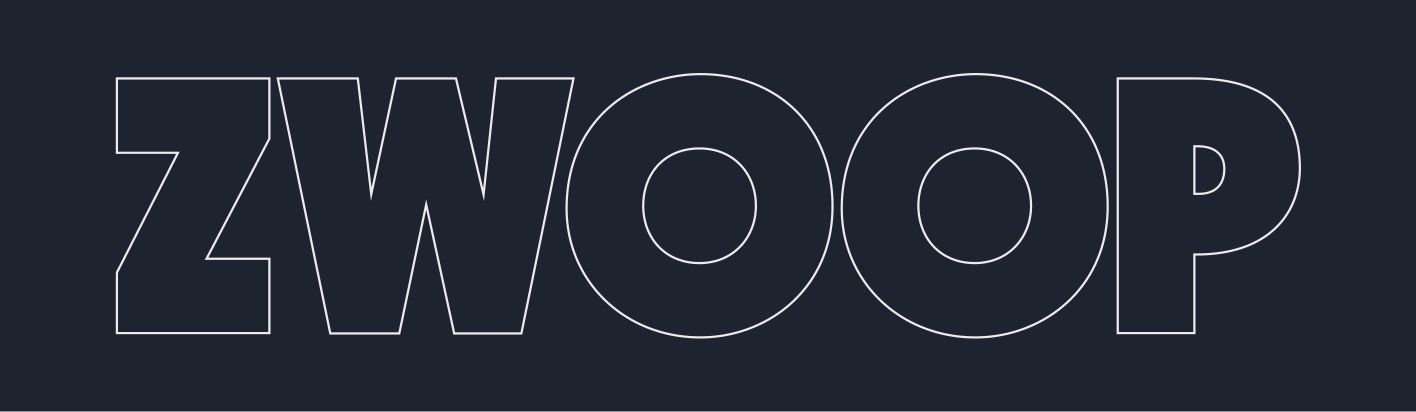
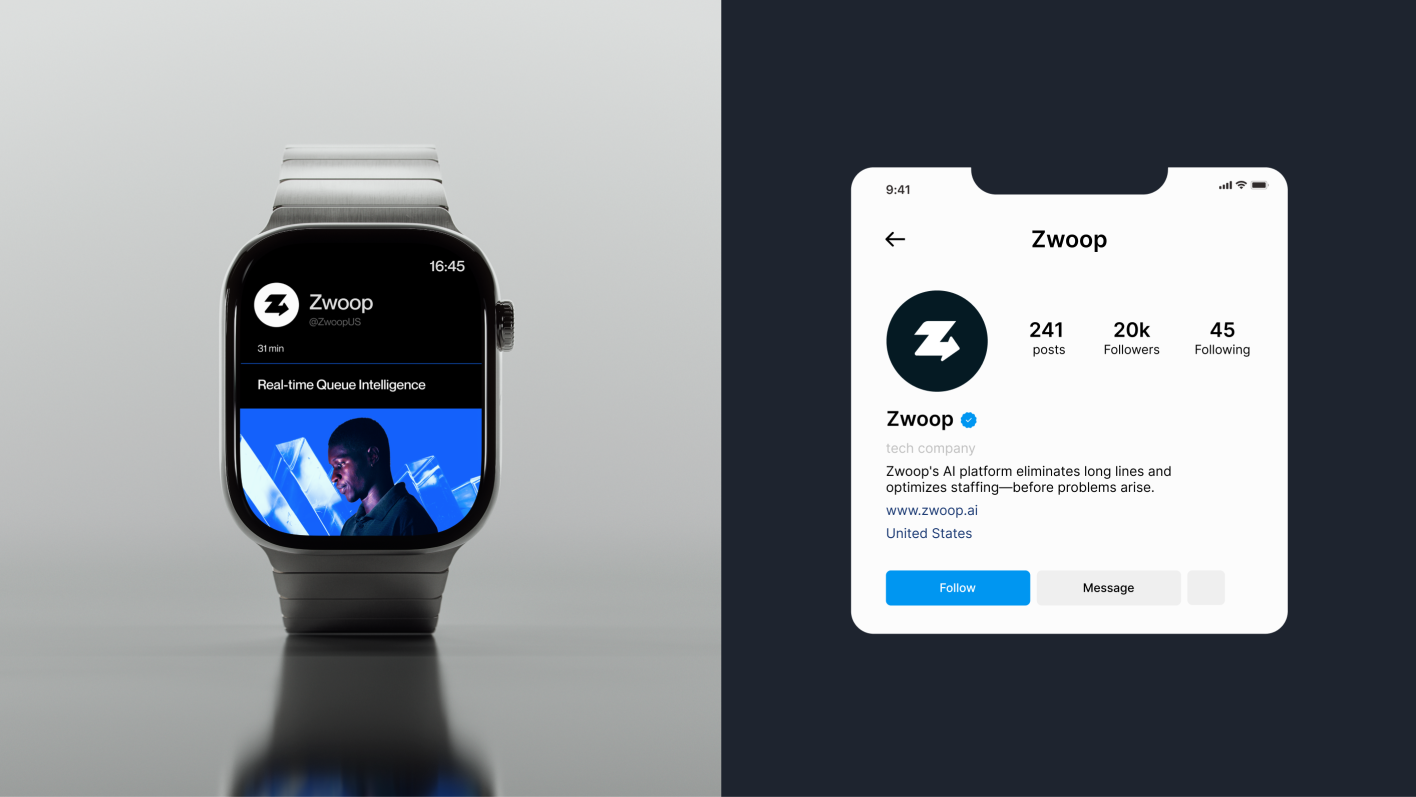
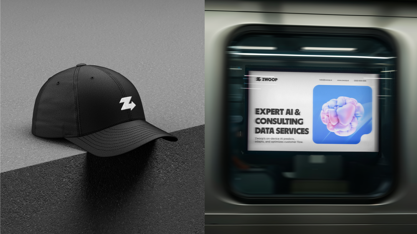
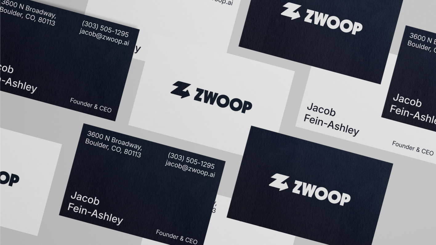
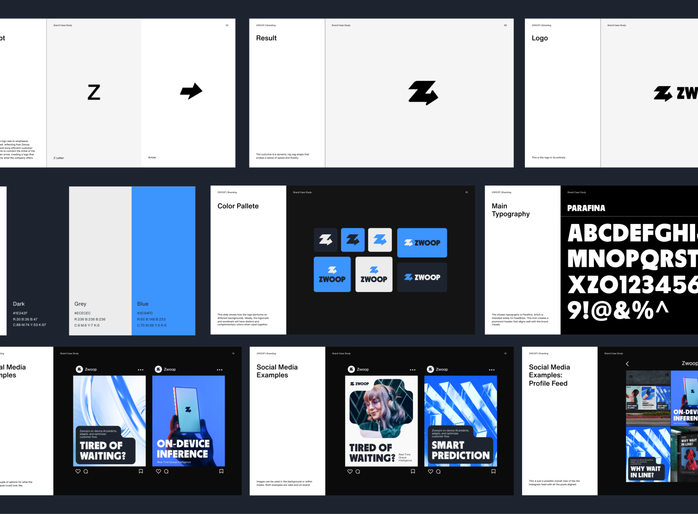
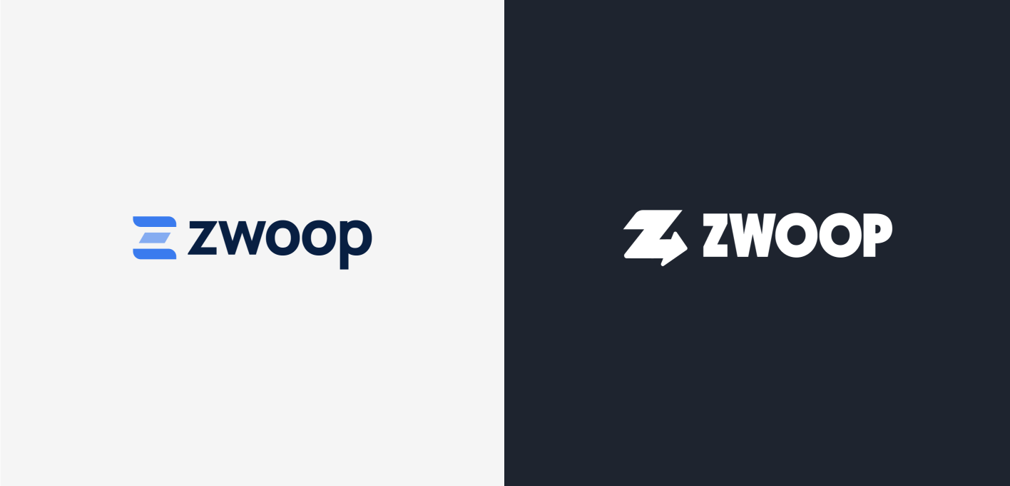
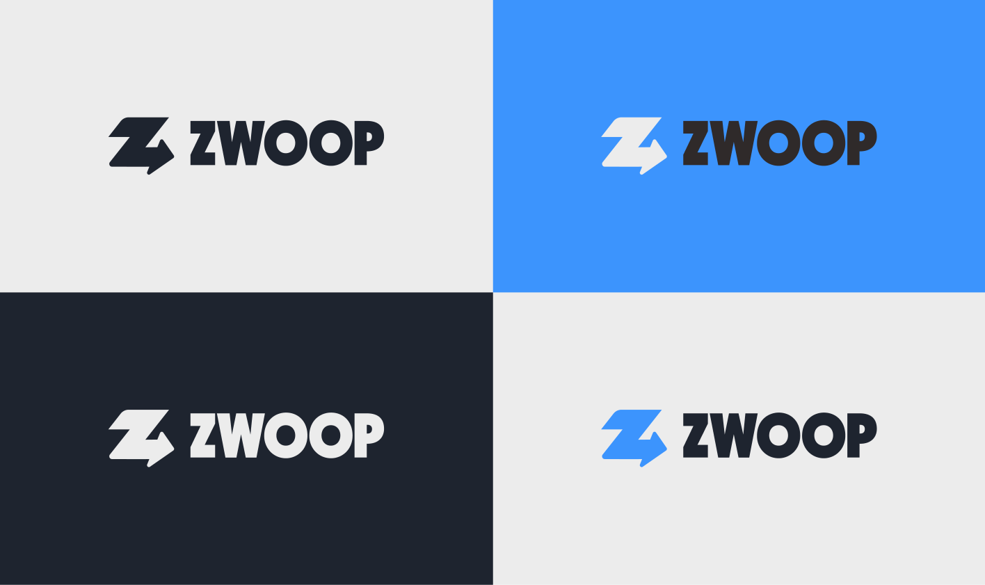
The branding approach was straightforward, intending to create a clean and informative identity. The logo is clear and concise, with several variations in its composition and coloring. A vertical and horizontal disposition will allow the logo to be applied in several formats without restricting its use.
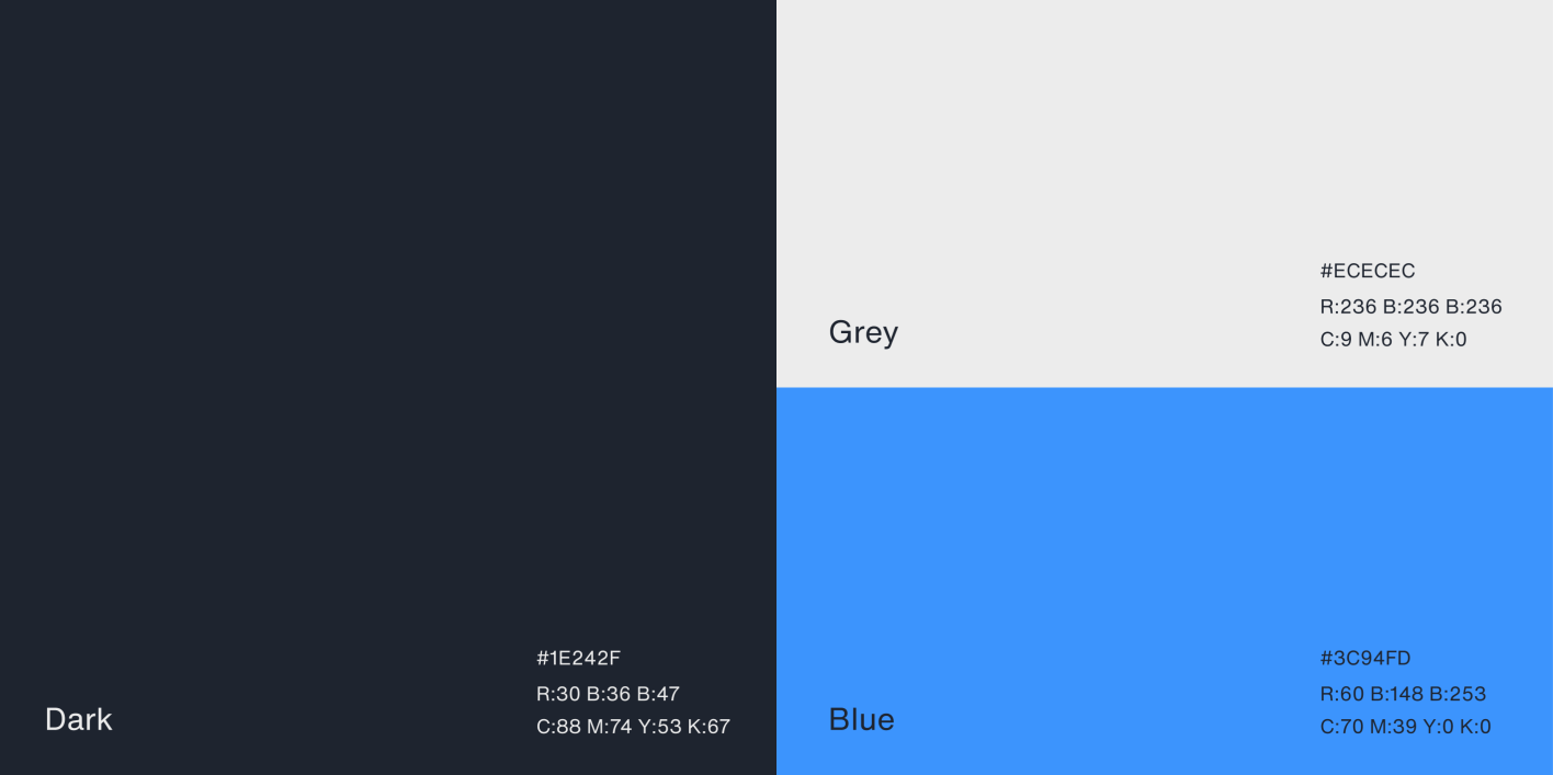
In terms of colors, the brand was divided into two complementary tones. The first one was blue, which represented the more clinical and private practice side, whereas orange represented the vast experience that the team has in helping sports athletes.
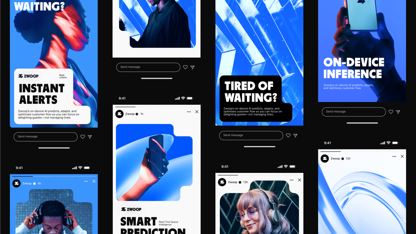
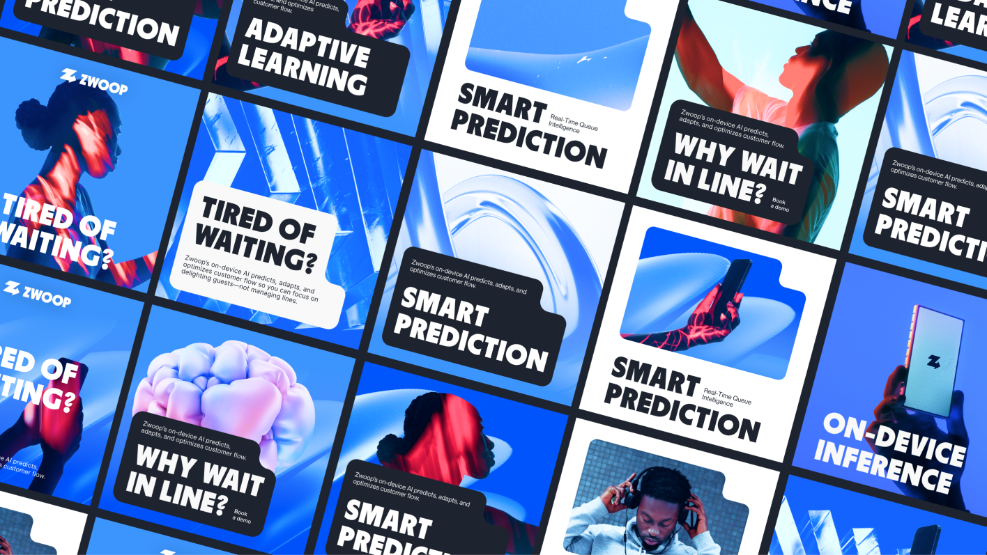
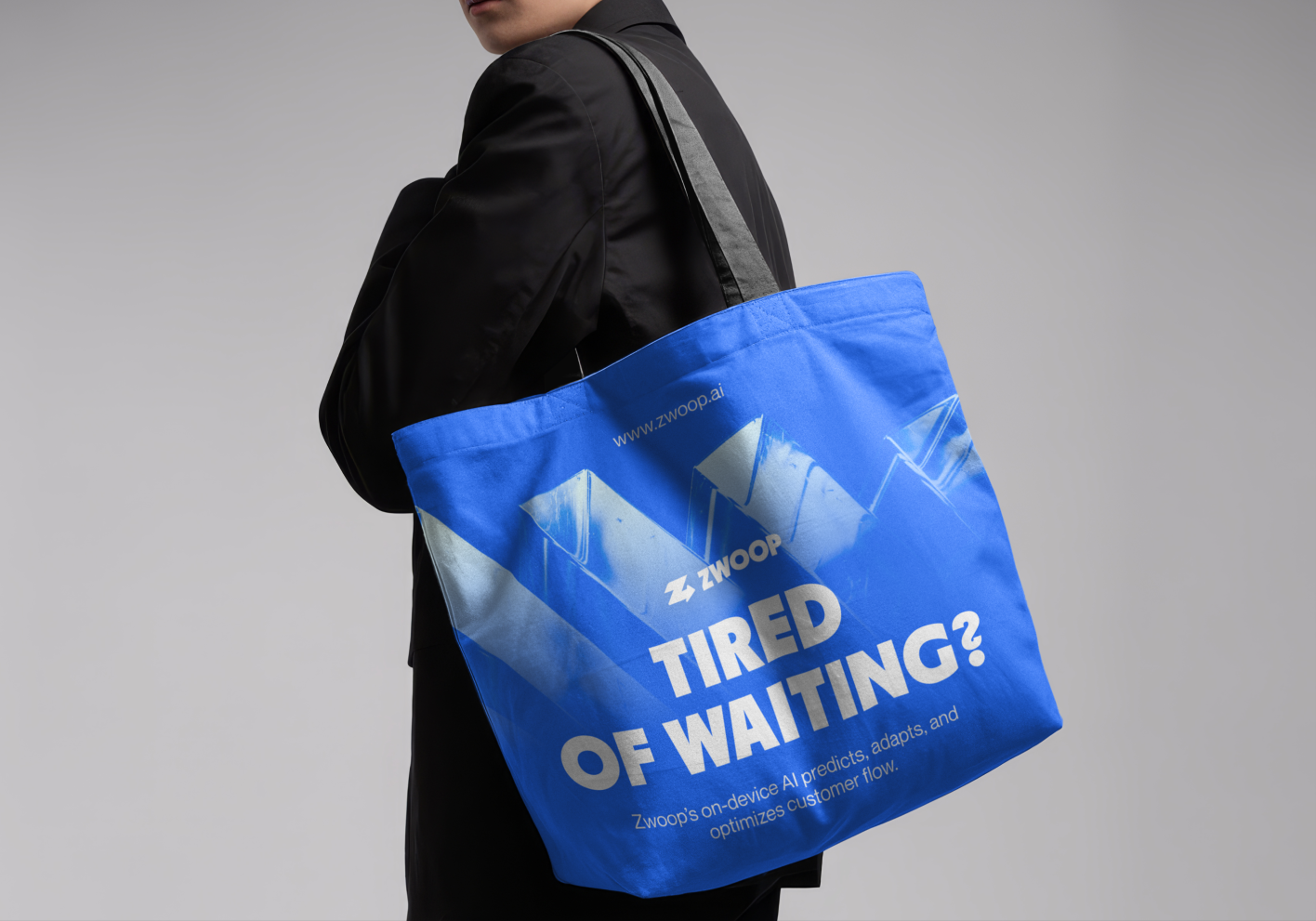
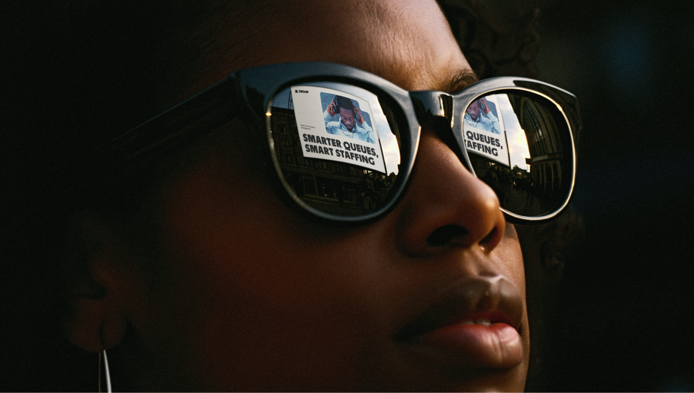
The overall application of the brand design focuses on creating a tech-savvy visual identity that resonates with the target audience. The concept is to combine images with subjects using technology, particularly conveying a sense of waiting. And contrasting that sense with abstract imagery that shows movement, segment and flow.